4 min read
🍾Common HubSpot Pop-up Mistakes and 6 Things to do Instead
![]() Amanda Berger
:
January 17, 2023
Amanda Berger
:
January 17, 2023
.png)
.png?width=1011&height=642&name=NEW%20OM%20Blog%20Post%20Template%20%20USE%20THIS%20ONE%20(9).png)
Pop-ups aren't popular. 73% of internet users don't like them, making them the least favorable advertising technique in existence. Why don't people like them? Because when you're in the middle of browsing a website and suddenly an intrusive ad appears, forcing you to look at it and deal with it, it interrupts your browsing experience.
However, we have noticed, time after time, visitors will come to a client's website due to paid advertising but convert on the pop-ups. We know pop-ups work and we insist all our clients implement pop-ups regardless of their personal feelings about them (e.g. all our tech CEOs dislike them intensely).
You are not alone if you hate pop-up ads.
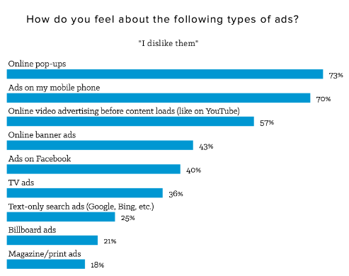
Source: HubSpot Adblock Plus Research Study, Q2 2016
On many websites:
- They're everywhere
- They appear nearly immediately after landing on a website and/or on every page
- They are repeated every time when visiting a website
- They feel irrelevant
However, as marketers, we know that pop-ups have their benefits. Research conducted by Sumo analyzing nearly 2 billion pop-ups found they convert just over 3%, with the top 10% of all pop-ups converting at over 9%.
But with the understanding that pop-ups annoy most website visitors, what can be done to increase their effectiveness without driving potential customers crazy? As with most inbound marketing strategies, finding a balance is key. Here are a few best practices:
#1 Time Them Right
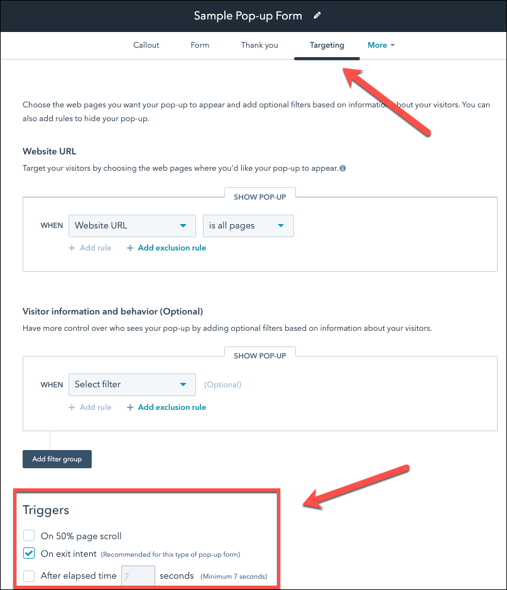
It's a good idea to delay pop-ups until after visitors have been on your website for a while. This gives visitors time to browse without interruption. HubSpot also allows pop-ups to be triggered on a page scroll, after a certain amount of time, or when they are about to click away from your website.
- Page scroll - the popup will appear when the visitor scrolls halfway down the page
- On exit intent - the pop will appear when a visitor moves their cursor toward the top bar of the browser window
- After elapsed time - the popup will appear after the amount of time specified
#2 Use Reasonable Frequency
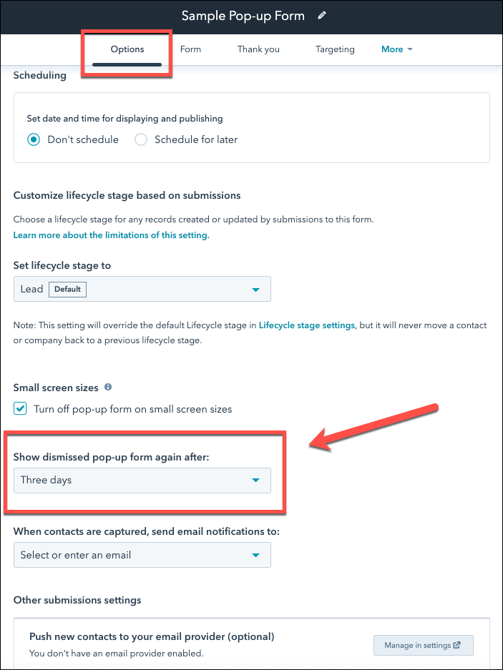
Bugging your visitors with the same pop-up, again and again, is probably not a great idea. Instead, set pop-ups not to be shown again after a set amount of time following when they are dismissed or ignored by a visitor. As a rule of thumb, we recommend avoiding showing the same pop-up to a given visitor within three days, but this can be set anywhere from one day to one month.
#3 Suppress Pop-ups on Landing Pages
The goal of the landing page is to provide interesting content that will leave a visitor wanting more and entice them to convert on that page's existing form. Therefore, it's not recommended to have a pop-up emerge covering content a visitor is already interested in. This can be avoided by setting up an exclusion rule to prevent pop-ups from appearing on a specific page (or pages) on your website. Note: for HubSpot pop-ups you need to drop the "https://"
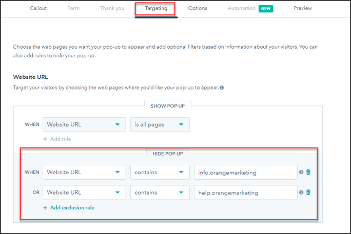
The above logic will also work to prevent pop-ups from appearing on ANY of your landing pages (e.g. website pages that contain ("info.orangemarketing.com").
#4 Monitor Which Pop-ups HubSpot is Favoring
This is tricky, as there is no documented explanation for why HubSpot favors some pop-ups over others.
What we know
If there are two or more pop-ups set to display on the same page, HubSpot will decide on your behalf which pop-up is performing better, and eventually only serve that pop-up to your website visitors. This means you will have to examine the data to see which one of your pop-ups is best converting. Likely, you will notice one pop-up is clearly being served the most and therefore carrying a higher conversion rate.
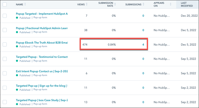
What we don't know
There is no published rule by HubSpot on the period of time they serve a pop-up before determining if it is a "winner" or "loser." Once this is determined, we also don't know if it is ever reevaluated again - but we're nearly 100% confident it isn't.
What we do
As a best practice, pop-ups should be reviewed quarterly. If the data shows a pop-up is favored and you don't love it anymore due to outdated content or any other reason, turn it off, so it stops delivering. This will force HubSpot to serve other pop-ups promoting the content you prefer.
#5 Setup Targeting When it Matters
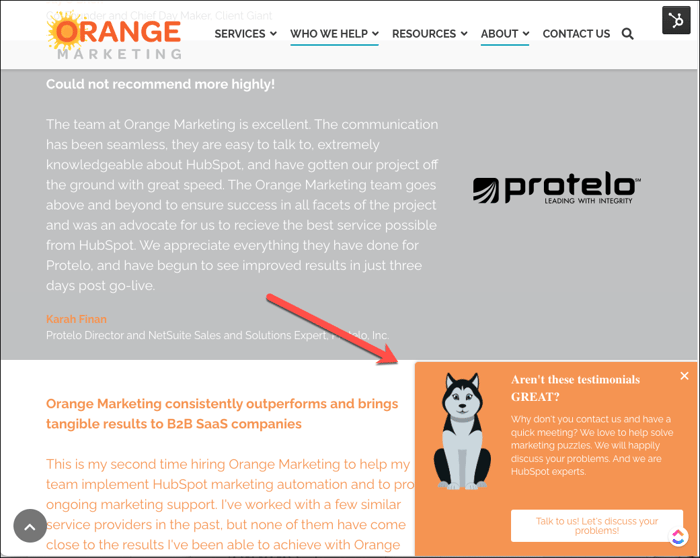
Pop-ups can be set to target specific web pages, allowing you to control the pop-up your visitor sees when they visit a particular URL on your page. Applying logic, you can create pop-ups with specific offers on targeted pages. Here are a few examples:
- A pop-up on a high-ranking blog post, with a free eBook offer related to the blog post topic
- A pop-up on your site's testimonials page, encourages the visitor to "contact us today!"
#6 Keep Your Pop-ups on Brand (as much as possible)
HubSpot has very few items you can control in the pop-up which can frustrate our brand marketers to no end. We tell them, in the short run, please "get over it" and the current HubSpot pop-up logic has 90% of what they need. We suggest they work with what HubSpot has, and hope that on the HubSpot roadmap, we'll eventually be able to control look and feel more (rumor has it this is coming).
Here is what you can control.
- Background Color - Pick your brand color
- Left Rail Image - Vertical orientation, 1300x1700px file size max of 2.39 MB. Likely originally this mechanism was designed for ebooks and whitepaper covers.
- Headline - Make it quick and snappy, short and to the point. All caps if if you want to stand out.
- Copy - However, don't try to do bullet point copy. It won't work
- CTA - Again, action-oriented.
- And finally, the link or landing page.
- We like to convert right on the pop-up meaning get the person to fill out the pop-up form rather than going to a page with a form. Then our final link is to a TY page, and we use a Workflow for a TY email. Conversion within a pop-up results in a higher conversion rate.
- Sending a pop-up conversion to another landing page to fill out the form is done when you have complicated lead logic or extra fields such in a typical "have a demo" or "register for a webinar" landing page.
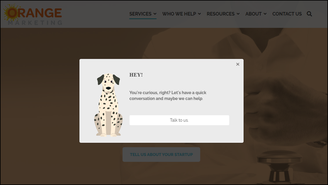
Test for yourself... Use an incognito window each time.
- Content Pop-up - Ebook - The Truth About B2B Email Deliverability
- Exit Intent Pop-up going to a Landing Page Open this page, page down, then head to the upper right corner.
- Targeted Pop-up - Our Testimonial Page and a Targeted Pop-up
We realize that HubSpot pop-ups can't always be controlled from a brand look and feel perspective, but they are an effective way to convert your anonymous website visitors into leads. Taking a little time to strategize pop-up offers, placement, and timing, and reviewing your pop-ups quarterly, will help you meet your goals faster while also being mindful of the user experience of your website visitors.
Looking for more B2B marketing tips? Don't miss our eBook, The Truth About B2B Email Deliverability.
